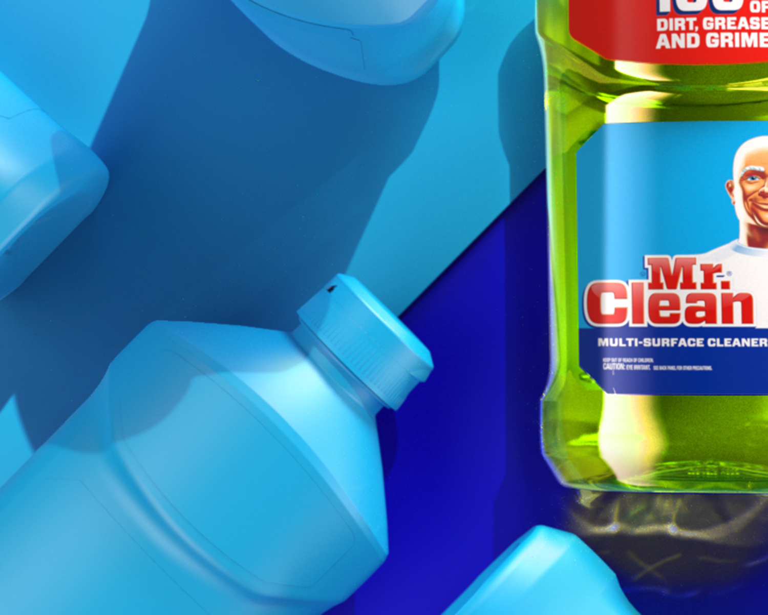
Mr. Clean
Shape Language
A Fresh Face for Mr. Clean: Efficacy and Whimsy at Shelf with more Impact.
Efficacy
The surface care category is first and foremost about efficacy. The shape language needed to convey that in a way that was appropriate for the band and immediately apparent to the consumers.


Power
The shape was inspired by traditional masculine shape elements, such as tools and truck grills. All the while careful not to follow that too far. There is still an applicable softness in how the elements transition. Such as how the body integrates with the chest plate.
Utility
The dual label ergonomic feature is a clear way to communicate the core values of the brand. While also giving the consumer a physical benefit. The pour spout cap was another clear benefit meant to create a clear sense of a better user experience.


Concept Sample
This is a small sample of the shape exploration. The full exploration included a wide range of ideas and shapes. Developed in both sketch form and rough CAD. Volumetrics is a big part of how the shape manifests, the exploration must include that level of attention.


Work


Contact
Phone: 646-241-3216
Email: paulfdiehl@gmail.com
Profile: Linkedin?
© pauldiehl 2024
creative director
Thank you for visiting