Enfamil
Shape Language
A Modern Touch for Enfamil:
Blending Science with Care
LOVE + SCIENCE
LOVE + SCIENCE
LOVE + SCIENCE

Warmhearted
This is a range of projects done for Enfamil from a super premium can for China to reinventing liquid formula globally.
The idea that lead all of the work was the essence of the brand feeling less about the technology and science behind the formula and more about the human emotional drivers behind it. The shape took on the role of conveying that the brand was about nurturing your baby's health, growth, and development.
Nutrition comes from healthy food. We extrapolated that into shapes that conveyed a sense of food and nutrition vs science and medicine


We created a new super-premium tier for baby formula in China.
Trust
The one-child per family law in China created an even more urgent sense of care for a family's new baby. Formula became an important part of that care as it offered a level of precise nutrients that focused on brain development, cognitive development, and immune health. Formula along with breast milk was a way to give your baby the best development possible.
The other major pain point for new families was domestic formula has seen some major issues with safety. The emerging middle class in China wanted an imported brand they could trust and was willing to pay for that extra sense of security.


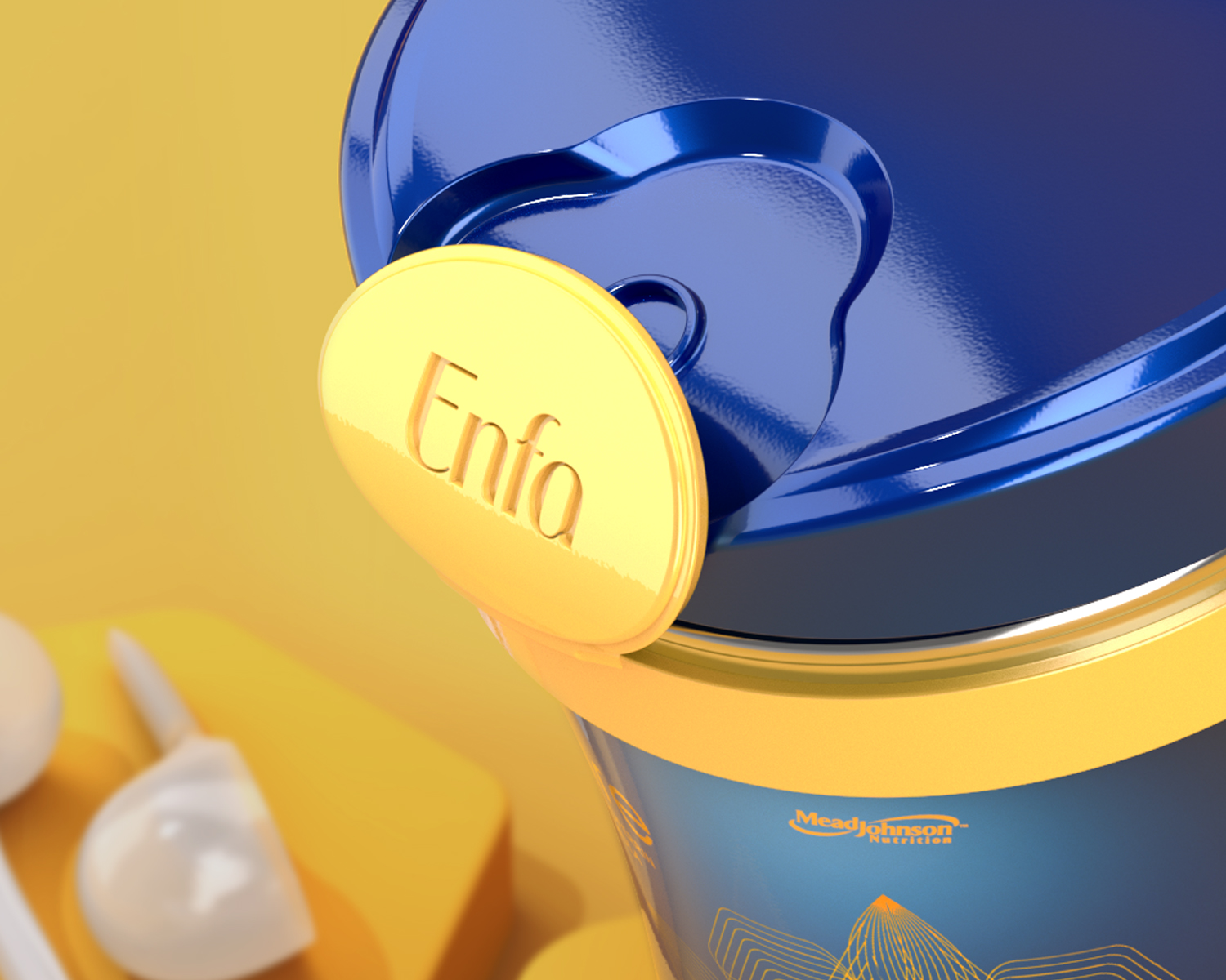
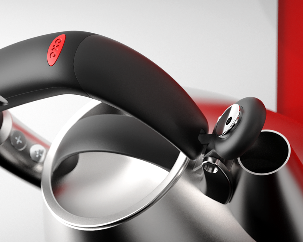
Cues
Safety drove much of the functional design of this package. The decision to use a steel can over plastic was a consumer insight gathered from extensive consumer research. Fears of the plastic leaching into the powder during its shelf life, steal was seen as inert and safe for baby.
The closure was the second crucial touchpoint to communicate safety. The latch needed to be apparent at shelf, while providing all the necessary audible cues to let the consumer know the package is closed and safe. The latch to be a welcoming design element vs a mechanical to maintain the warm-hearted aesthetic
Spoon
The scoop is an important touchpoint in the usage scenario of making formula. A scoop is a measuring tool, that can feel medicinal and not nurturing. Baby isn't sick, baby is hungry. There is an inherent opportunity to create a moment that feels more like making food vs making medicine.


The success of the shape language led the package to be #1 in its category


Food
In the image above the steel can was the previous package on market. In the current category landscape, it was very outdated. The carafe shape was chosen to create a familiar food shape that is appropriate for the warm-hearted expert consumer. The flip cap delivered on the pain point of preparing a bottle while holding the baby. Providing a user experience that was superior to the competition.


Growing
The 8oz single-serve package became an interesting opportunity and challenge. A standard nipple can be attached to make feeding on the go less painful. That presents it' own challenges if baby doesn't finish the bottle. There is a need to keep it as clean as possible and mitigate waste.
The other opportunity is for older children. Toddlers can hold the bottle on their own but their motor skills may not be fully developed. The team developed several ideas for the package that could grow with our consumers.


Work


Contact
Phone: 646-241-3216
Email: paulfdiehl@gmail.com
Profile: Linkedin?
© pauldiehl 2024
creative director
Thank you for visiting